Monday, May 3, 2010
Saturday, March 20, 2010
Rucker Park- Mecca
Rucker Park is a basketball court in Manhattan New York. Many professional basketball players in the United States consider it as the Mecca of basketball, having been the home of some of the greatest basketball professional and “underground” players since its creation in the 1950s. It has also been a spot wherein the hip hop culture has mashed up with the sport, and has given rise to this street, urban hip-hop basketball subculture that is now famous in the United States and worldwide.
It has been “controlled” or “marked” mostly by its hometown heroes who “protected” their home courts against players ( professional and “street”) who come from different places to play in this court. The park is rich in history and in stories of legends playing against each other in this court. Given such a huge following in such a small place, gave the park this “unwritten exclusivity code” wherein only the best can play, and on huge games, only the friends and “VIPs” can sit in the benches and stands, all other “fans” can just be seen watching from the fences to as far as the top of buildings near the area.
The place used to communicate a certain raw and urban feel, having just metal backboards and nets and just a few seats. But its popularization in urban culture made it a “hotspot” for corporations to “advertise” and “own” this area, which gave about a tremendous amount of development, from glass boards, better surfaces and shot clocks, as well as a load of advertising and events conducted in the area (it even has its own website!).
As a young basketball fanatic back in the day, it was my dream not only to visit this place, but to be called “worthy” of playing in it. In addition, I had aspirations not only to be as good as the players at Rucker Park where, but to belong with them at the same time.
Thursday, February 25, 2010
Down to 2 Concepts and rough campaigns for each
I.Design=Life=Sports=Andro
Design, as with life, as with sports as with me, is not all about the end or the finishline, but the journey. A great journey that deals with a lot of sacrifice, and learnings, defying yourself and your limits in the pursuit of achieving a goal. It deals with a lot of hard work, a lot of long hours and focus to get the job done. Nonetheless it is an exciting trip of living one's passion, being the best that you can be and laying it all on the line for an opportunity to make a mark in the world. If you think it's hard work, it sure is, but it involves a lot of fun and a lot of love to do this on a daily basis.
In gist, Design/Sport: sacrifice,passion,training,journey,defying self, love
as for me: belief that my best work is my next work, "process-man", hard working, sacrificed a lot, sees each piece not as work, but a opportunity to be great.
So I did a lot of writing and sketching and came up with 2 ideas drawn out from this concept
A. ( working titles) Behind the scenes/no turning back
This takes involves of the things you dont see in a finalized design; the sketches, the mind maps, the long hours and coffee and of course, the crap work. This take of mind will give audiences a peak and a visual narrative of seeing what goes behind the final work; from the different sketches and versions, to photographs and memoirs from myself.
Business Card
Front: final aesthetic
Back: Corrections, grids, edits, sketches of drawn out to create the front side
Print/Outdoor
Front: Final works
Back: Corrections, grids, edits, sketches of drawn out to create the front side
Images during the "journey"; cups of coffee, a blank page, sketches, pens, me sleeping,etc.
Site
The site will have a very slick and minimalist layout and wireframe( here's where I apply the black/white conecpt I took out) which shows them behind the scenes pictures and sketches as a supplement to my work. Flipping the images of my works takes them to the journey of how I began and reached to that piece.
2.0 aspect ideas
-feature different works of mine, and other works and invite other people/designers to comment on how they would do it and/or how they did it
- celebrate sketching; submit your sketches, your ugliest work and all the crap youve done and let's just look at them!
B. Progress/Move/Forward
Same concept.Different execution. Instead of flipping the before and after..I plan to really show them upfront the progress and journey of my work.
Card:
Front: Final card
Clear sheets: different versions,grids, of the design
This would be an outdoor activity, starting with scattered billboards with different text reading the idea or objective of a particular campaign. Each week, the billboard progresses until the final work is shown.
Web
a) Grid and flash play! A lot of transitions,movements and shifts showing how different works have progresses. Will also feature a commentary on the process of my work on each one( thanks Sarah for the site you sent!)
b) Same idea for "works" part of the site, but an option in the site appears wherin they can click each time and refreshes the site layout and design, showing the diffrenet versions, sketches and wireframes for the site
2.0 aspect ideas
- timelapse; pool of videos showing how designers/ and me have progressed on each of our works
- vlog/chat community wherin we can share and help each other in design, be it designers,clients, or audiences.
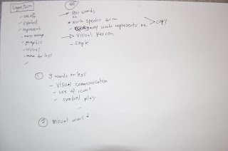
II. LogoIcon
Logos/Icons are great communicators. The say it with visuals,images and often times, without words. They represent and embody so much things, contain so much information and meaning, and somehow say all of it and more in just one execution. They are very subjective, yet they are universal and in their simplicity and humility, they say more, and they are great. To be as close as a communicator as a logo would be my greatest aspiration as a designer, and I'm constantly busting my ass to be one.
Logo= one off, symbol,embodies a lot, visual, graphic, more for less, simple, humble,great
Me= man of few words, quiet, simple. Visual person. I let my work speak for me. My works are my logo.
I had different ideas for these, all of which after seemed that I can tie them all into one, so here it is...
A.(working titles) Represent/get the picture/simplfy/3 words or less/ one off
Card
A wordless card, showing just my logo( which I have to work on..a project in itself) and just my website and/or contact info
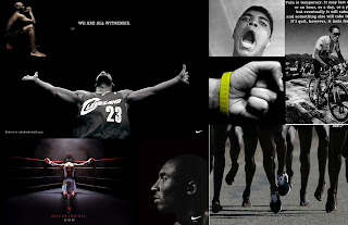
An array of popular print ads and how I would interpret them with an icon/logo.
Web
A visual protfolio, just icons and images of my different works in different mediums( all represented by logos), and just 3 words or less to describe each work.
2.0 aspect
-logo design blog
- gps feature of different designers/studios/schools/etc represented by their logos.
Tuesday, February 16, 2010
Back to sketching
What I ended up with are a batch of obsolete audio materials: the vinyl, cassette and the CD. All of which contain audio files and data no longer needed and are old to me. Both were once significant tools to store data and are no, nothing more than just trash. In some way, I wanted to reflect the obsolescence of these things and at the same time communicate their purpose before. Essentially they store data in analog or digital form. They are tangible things of software and information that were once important. Now their purpose of storing is no longer efficient and up to date, and they are now pretty much just trash. So why not assemble them together to store something once again, why not make them a waste basket of storing similar "obsolete"/junk stuff.
Below is just a mind map of how I came up with the idea and a few sketches of how I plan to do it.
On the side,the readings helped me a lot in getting the craft and ideas working. I was pretty much focused on looking at examples on the web, research online and just spending lots of time in the computer that I forgot the purpose of the project: to start going back to basics and working with the hands and the mind, rather than all the references and information that goes with it( stuff that are nonetheless, important, but just TOOLS to get the job done).
Monday, February 15, 2010
Me and My works
1. Running Room Company Brochure
Everybody runs. But each person has a distinct and unique reason for doing so, from the weekend road racer to the ultramarathoner. Runners run fro causes, purposes, goals, hopes, and to prove something. We run for different things, we are each unique yet in the same way, universal. I run because takes the perspective of the different runner and how these purposes drive the company to be the best and biggest at what they do, for Running Room are runners too.
This is one of the works closer to my heart because it was about one of my great passions. I really wanted to communicate and show the experience of running; the community, the highs as well as the sacrifice and lows. I wanted to represent my company as it were a runner, taking them close to the heart rather than taking them big and out of reach. Simplicity was a major design aspect, using a simple grid, 2 colors and one choice of font proved to have spoken volumes for them.
2. One Campaign
A magazine ad targeted to the digital culture, I wanted to visually communicate the power of technology with regards to changing the world for the better. By using a visual manipulation and word play, my attempt was to empower the viewer on how simple taps on the keyboard and result to great changes.
This was a visual execution process, and I was hard on trying to use everyday things as a means of communicating worldly change. My purpose was to empower and inspire and as well as to make the issue and problems closer to them as well.
3. Carmielocsin.com
The portfolio website of make-up artist Carmie Locsin, the website showcases her work, as well as gives you a feel of her work environment and style.
www.carmielocsin.com
I had the pleasure of working with Carmie, who knew what she wanted and was also ever open to new ideas. We wanted to mix professionalism and playfulness, communicate sleek and simple with fun and friendliness. The overall look is very basic and minimalist, yet the interactivity and captions were a bit playful and free at the same time.
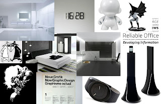
4. Boston Marathon
I had the awesome challenge in class of promoting the Boston Marathon to the world's best amature athletes with the concept "are you strong enough."
By using the vertical limitation of a magazine ad to my advantage, I was able to better communicate the toughness of both the audience and the event.
So how do these design relate to the designer?
Design is all about putting in a lot of effort to make it look effortless. I believe in the simple complexity of the craft, and how design is natural, reflexive and powerful. Design is to stir and awaken rather than just appeal and promote. I believe that each work lies so much more than what it is for, and I aspire to bring those elements forth in every piece. As unconsciously as they might be perceived, design is a soulful process and humanistic as it can be. I see every design with so much promise, potential and power than what's just laid out there. The brief are the requirements and intangibles, design is free and limitless.
3 concepts/mindmaps + taking it further
This first concept is in line with how I see and believe that design is not about the flashiness and hooplah but having amazing aesthetic and concept by simplicity. I see great design in plain things, the simpler they are the more confident its message comes across to me, and this is how I approach design, and how I want my designs to be, without frills, pure and simple, and fantastic in its own right.
I want this concept and design to be slick and simple, classy without being flashy and organic and symmetrical, just natural. More with less.
2. DesignSport
design is passion, it's also about pain. A lot goes into something as simple as the poster, and even though much of a piece is appreciated with its visual, its message, its type,etc..design is also a lot about the unseen. The creative process, the ideation, the training and the long hours at the blank page, these undertakings are what designers better and great. Designers are not born that way, but they grow up dreaming, practicing and experiencing, and this is what separates them from just another guy who knows photoshop.
This concept takes on a very difficult task of jolting up the emotions and guts. This take will sort of communicate my journey through design, ,my work and the work I put in to each one. This will take on a more memoir-ish and photographic aspect showing the "life and passion" of a designer and just show how much I pour my self out with each work.
2. LogoIcon
Similar to black and white, this concept communicates the power of the "one off." Being more with less and saying things without words. THis will be a very fluid and natural take on design, and on how I see the messages in the figures the images the icons and the symbols. Design, more than a process of representations, branding and imagery, symbolizes a lot of things, and this concept communicates my vision of design as both the signifier and the signified.
Thursday, February 11, 2010
Mindmapping myself
After listing them all down, I took it a step further by exploring these items and transforming them into concepts/ideas I can come up with campaigning myself(haha), and here's what I narrowed them down to:
1.DesignSport- I love sports. More than the camaraderie, the exercise and the gear, I love the feeling of pain(yes!), and how, with great sacrifice,endurance and hard work, it is transformed into energy, success and greatness. I love how sports are a metaphor for life, and for this one, design. I believe that talent can only get you so far, with a lot of hard work, training and sacrifice, I believe that those things are what really sets a designer apart from just a guy who can draw cool logos.
2.LogoIcon- I have this philosophy that if you can't say it in a few words, then it's not worth saying. I love the genius in visual communications and the idea of the "one off", on how you can say so much(everything) in a sentence, a word, a picture, a logo. This is what I aspire most as a designer, to not only be a communicator but a creator of great symbols, icons and messages( in 2 words or less hehe).
3.BlackandWhite- Night and Day.Plain and Simple. You get it or you dont. The list goes on. I'm a minimalist by heart and action and the cleaner things are, the better. I believe that design is simple, without frills and amazing in its humility and purity. The aesthetics of blacka and white are so clear cut and simple and that is how I work, how I see things and how I want my messages to be seen.
How's that??
for next week: mind maps and further developments!
Project Me
Name: Alessandro Atienza
Alias/Nicknames: Sandro, Andro, Duy,Dro, Android, (often mistaken as)Anjo/Andrew
Background: Marketing and Management-basically anything to do with the "client side" of business
Trivia:
- born and raised in the Philippines
- played varsity basketball and swimming during his heydays
- loves anything sports, sunny and serene
- left handed
- fan of the Beatles, Chicago and James Taylor
- survived 72 hours with no sleep
- avid biker and runner( a big deal for a kid who grew up with those "Forest Gump shoes")
On how I fell in love with what I do:
- started out copying/tracing cartoons and typography at age 5
- set on becoming an artist and a doctor at age 12
- became business-minded at 20
- grew jealous of the freedom and genius of creative endeavors and jumped ship to where I am today
What I love about design:
- I love coming up with ideas so unique and universal at the same time
- to be inspired and inspire others with something visually appealing and meaningful
- genius of the one off( tag line, logo, visual,text..)
- connecting people, delivering the message
Too legit to quit( or, "on what is my differentiating factor")
- I think creatively,conceptually different
- I'm fast, but not furious
- I let my work speak for me
- my background takes me beyond
My goals:
- to create my own swoosh
- to live out all the stress, joy,highs and low's that is advertising
- to play one on one with Kobe
- to finish the Ironman in Kona
Tuesday, February 9, 2010
CD Project
Looking through all the piles of throwaways I have, what caught my attention was the piles of CDs I have. They were once the pinnacle of technology, compressing so much different data into one object. Now, with the event of the USB and other smaller/more digital forms of data transfer/saving, CDs are slowly on the decline and at most seen as a wasteful form of technology.
I wanted to create something out of the whole package( including the case!) Something totally unexcpected which would still reflect technology in some way, So I decided to create a lamp/ dream catcher out of them.
All it took me was years and years worth of CDs( now backed up in my external drive), the cases, super glue and a string.
Gluing takes a lot of time cause of their glossy materials, but it seems that I am on my way on just putting the different elements together and start combining them with the aesthetics I had in mind.
Hope to be done by this week, so stay tuned!
Tuesday, February 2, 2010
GO BANANA- to the Web(2.0) and beyond!
The web component will be where it's all at. Firstly, it will be where we can start injecting the information on the benefits of eating bananas and give them facts as well as sources on where they could get them. Secondly, the web aspect of the campaign will be the connecting factor in which we hope to truly interact with the audience as well as to have them connect with each other, wherever they maybe.
In creating the site, I first had to draw back on what I want to feature in it, here are just the following:
- contain the TV spots and youtube links on the prior and current stage
- give info,facts,trivia and other details on bananas
- have them interact and connect to each other by ways of:
- upload their own videos on how theyve "gone bananas"
- rate, chat and connect with each other through a community page
- find banana stands where they can buy banana merchandise and celebrate "going bananas"
- a blogroll in which they can post crazy(banana stuff) in the web.
- follow banana with its next adventures through twiiter/facebook
After coming up with the contents, I then had to take inspiration on how to draw the people to get there by making a pretty good looking site. Here's a mood board of the cool stuff i saw:
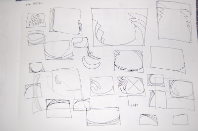
Of course, I had to start with some sketches...
And here's what I came up with which Ill discuss further in class!
Main Nav Interface, interactivity and animation:
In a nutshell the mainpage will introduce them to the banana and communicate the active, energized vibe it promotes. Much of the activity that will happen here is just show thew clips of bananas adventures and introduce them to the main navigation of the site. A twitter and facebook option appears so users can follow banana on his adventures.
TV AD Page
Go Bananas-Community Page- The community page will be a virtual hub wherein they can upload videos, comment and rate them as well as chat with different "bananas" around the world. Different topics will be posted on this site every so often to promote some disscussion and videos from banana himself around town will be uploaded to keep the ball rolling.
Bananas in the real world-the banana stand
Apart for the social networking site and blog roll, the banana stand's goal is to provide as a hub wherein people can come together in addition to the virtual community the site will offer. It will be "selling" merchandise, banana costumes, banana treats in exchange of points everytime they buy bananas.
..and they lived happily ever after
The narrative of my campaign started of with a spark of a stunt which will then strech out to larger audience as the tools I will use to promote the campaign get bigger in scope. At the same time, the level of interaction with my audience will also increase as I move from a purely visual execution to one that will enable them to interact as well as connect to a wider scale in unison of the campaign and what it promotes. Web 2.0 will trigger the campaign to go big and global and leave a lasting impression and community that will be aware and involved with recognizing and taking part of the benefits of eating bananas!
GO BANANA- Concept and Campaign
With all the info in mind, it was now time to go back to the drawing board and start mapping out ways to promote bananas in line with my market. I was especially on the look out for things that are related to my audience as well as facts and info on the fruit that i felt that i could communicate to the market in such a way that comes across well.
So what stood out for me were the terms "bananas", "it's bananas" and "going bananas" that were still affluent in our present society today. With the ideas of doing something crazy, insane and out of the blue ( as the terms suggest/mean), I then thought of concepts and executions to communicate just that but this time around, carry the significance and value of what bananas are all about.
Then it came to mind that in common knolwedge and pop culture, bananas had always been known to be the fruit that you would eat/snack to give you that energy boost and fill when youre kind of whining down ( as seen in TV, athletes,etc). So what I had to do was to find a connection with the saying and the real value of bananas...and came up with this over-all concept:
GO BANANAS!- go crazy, defy limits and do anything with bananas. This awesome power fruit is THE snack to give you that energy boost so you can go all the way! ( or something of this sort)
So I started thinking along how bananas help break peoples norm, or make them achieve things they normally couldn't or have can just dream of, and narrowed it down to something carzy but not too hardsell( conversely, overly hard sell that its retro-cheesy) to "market" to the tweens.
GO BANANA- THE CAMPAIGN
The campaign's protagonits, is of course- Banana; a giant sized banana all jazzed up in seizing the day and helping tweens and teens do the same. The campaign revolves around how banana goes bananas and just shakes everything up to give you that boost and energy to liven up the day.
CAMPAIGN NARRATIVE
With a not so "pop culture" inclined market in mind, my campaign involved 2 stages: the primer and the banana levels of the campaign.
Stage 1: Primer
- The objective of which is to just get the buzz around and not really "promote" per se with my audience. What matters is just to get the word out and create a certain noise of crazy people in banana suits roaming around the city. To at least supplement these stunts, a teaser web and media outlet will be attached to give the campaign some hype and tease the audience that more of this bananas will be coming out.
Stage 2: BANANAS!
- In a blink of an eye, these stunts and small crazy things turns into a big campaign involving, print, TV and a web 2.0 accessory to further bring the noise to a larger audience. The same concept and execution will be carried on, though this time, value and information and community interaction will be involved.
Here's a summary of the campaign:
STAGE 1 in brief:
1.Gorilla Advertising- feature hand held video clips of banana doing bike stunts, b-boying and skateboard tricks around the city.
2.Peelers- peelers will be found at coffee cups, books, magazines and free newsprints
3.Print Ads- print ads of banana doing such things scattered around bus stations, malls and other high traffic areas
4.Web Tease- web teaser: will just show youtube clips of the ones mentioned above ( with a super: will go bananas in x days)
STAGE 2: BANANAS!
1.TV Series
- 4 30s/15s TV spots of Go Banana!
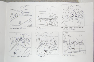
- these TV spots revolve around a metaphor of sorts on how bananas solve different health problems, played out in funny sequences.
SPOT 1: B.S. ( insight: Bananas' complex carbs stop the worst of sh**s)
SPOT 2: Depressed ( insight: Bananas contain trytophan that fights depression)
SPOT 3: Glass Bones ( insight: Bananas contain fiber that give you energy)
SPOT 4: Nerves ( insight: Bananas contain vitamin B thats good for your nervous system)
Every ad gives a link to the website which wil then take them to a whole new portal....