I.Design=Life=Sports=Andro
Design, as with life, as with sports as with me, is not all about the end or the finishline, but the journey. A great journey that deals with a lot of sacrifice, and learnings, defying yourself and your limits in the pursuit of achieving a goal. It deals with a lot of hard work, a lot of long hours and focus to get the job done. Nonetheless it is an exciting trip of living one's passion, being the best that you can be and laying it all on the line for an opportunity to make a mark in the world. If you think it's hard work, it sure is, but it involves a lot of fun and a lot of love to do this on a daily basis.
In gist, Design/Sport: sacrifice,passion,training,journey,defying self, love
as for me: belief that my best work is my next work, "process-man", hard working, sacrificed a lot, sees each piece not as work, but a opportunity to be great.

So I did a lot of writing and sketching and came up with 2 ideas drawn out from this concept
A. ( working titles) Behind the scenes/no turning back
This takes involves of the things you dont see in a finalized design; the sketches, the mind maps, the long hours and coffee and of course, the crap work. This take of mind will give audiences a peak and a visual narrative of seeing what goes behind the final work; from the different sketches and versions, to photographs and memoirs from myself.

Business Card
Front: final aesthetic
Back: Corrections, grids, edits, sketches of drawn out to create the front side
Print/Outdoor
Front: Final works
Back: Corrections, grids, edits, sketches of drawn out to create the front side
Images during the "journey"; cups of coffee, a blank page, sketches, pens, me sleeping,etc.
Site
The site will have a very slick and minimalist layout and wireframe( here's where I apply the black/white conecpt I took out) which shows them behind the scenes pictures and sketches as a supplement to my work. Flipping the images of my works takes them to the journey of how I began and reached to that piece.
2.0 aspect ideas
-feature different works of mine, and other works and invite other people/designers to comment on how they would do it and/or how they did it
- celebrate sketching; submit your sketches, your ugliest work and all the crap youve done and let's just look at them!
B. Progress/Move/Forward
Same concept.Different execution. Instead of flipping the before and after..I plan to really show them upfront the progress and journey of my work.
 Card:
Card:Front: Final card
Clear sheets: different versions,grids, of the design
This would be an outdoor activity, starting with scattered billboards with different text reading the idea or objective of a particular campaign. Each week, the billboard progresses until the final work is shown.
Web
a) Grid and flash play! A lot of transitions,movements and shifts showing how different works have progresses. Will also feature a commentary on the process of my work on each one( thanks Sarah for the site you sent!)
b) Same idea for "works" part of the site, but an option in the site appears wherin they can click each time and refreshes the site layout and design, showing the diffrenet versions, sketches and wireframes for the site
2.0 aspect ideas
- timelapse; pool of videos showing how designers/ and me have progressed on each of our works
- vlog/chat community wherin we can share and help each other in design, be it designers,clients, or audiences.
II. LogoIcon
Logos/Icons are great communicators. The say it with visuals,images and often times, without words. They represent and embody so much things, contain so much information and meaning, and somehow say all of it and more in just one execution. They are very subjective, yet they are universal and in their simplicity and humility, they say more, and they are great. To be as close as a communicator as a logo would be my greatest aspiration as a designer, and I'm constantly busting my ass to be one.
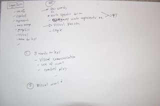
Logo= one off, symbol,embodies a lot, visual, graphic, more for less, simple, humble,great
Me= man of few words, quiet, simple. Visual person. I let my work speak for me. My works are my logo.

I had different ideas for these, all of which after seemed that I can tie them all into one, so here it is...
A.(working titles) Represent/get the picture/simplfy/3 words or less/ one off

Card
A wordless card, showing just my logo( which I have to work on..a project in itself) and just my website and/or contact info
An array of popular print ads and how I would interpret them with an icon/logo.
Web
A visual protfolio, just icons and images of my different works in different mediums( all represented by logos), and just 3 words or less to describe each work.
2.0 aspect
-logo design blog
- gps feature of different designers/studios/schools/etc represented by their logos.
No comments:
Post a Comment