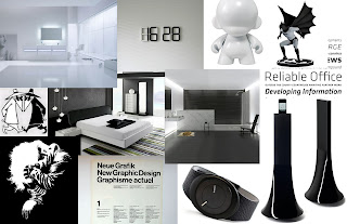
This first concept is in line with how I see and believe that design is not about the flashiness and hooplah but having amazing aesthetic and concept by simplicity. I see great design in plain things, the simpler they are the more confident its message comes across to me, and this is how I approach design, and how I want my designs to be, without frills, pure and simple, and fantastic in its own right.

I want this concept and design to be slick and simple, classy without being flashy and organic and symmetrical, just natural. More with less.
2. DesignSport
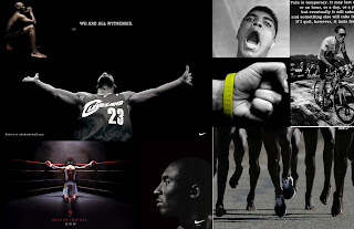
design is passion, it's also about pain. A lot goes into something as simple as the poster, and even though much of a piece is appreciated with its visual, its message, its type,etc..design is also a lot about the unseen. The creative process, the ideation, the training and the long hours at the blank page, these undertakings are what designers better and great. Designers are not born that way, but they grow up dreaming, practicing and experiencing, and this is what separates them from just another guy who knows photoshop.

This concept takes on a very difficult task of jolting up the emotions and guts. This take will sort of communicate my journey through design, ,my work and the work I put in to each one. This will take on a more memoir-ish and photographic aspect showing the "life and passion" of a designer and just show how much I pour my self out with each work.
2. LogoIcon
Similar to black and white, this concept communicates the power of the "one off." Being more with less and saying things without words. THis will be a very fluid and natural take on design, and on how I see the messages in the figures the images the icons and the symbols. Design, more than a process of representations, branding and imagery, symbolizes a lot of things, and this concept communicates my vision of design as both the signifier and the signified.
Hi Andro!
ReplyDeleteThanks for the comments. Love the design on that shoe you sent. Thanks for the ideas.
Here's my thoughts. The two concepts that have the most legs for me are Design Sport and Logo Icon. I just find that the Black and White theme (minimalist) has already been done. You're just so much more interesting than that.
Design Sport - further developing the idea of "pain" is interesting. As a designer, copy writer, anything creative, there's an endurance and a process that could almost be related to giving birth to a great idea and future design. It takes time and a lot of thought to come up with something great.
Logo Icon - the idea of melting an elevator pitch down into an image, is very cool and very relevant to what designers do. This is my favourite of the two concepts. It's simple, makes the viewer think, experiment with a the site and try to figure out what's going on here without words. Here's a website for a guy who does a good job of mapping out his process for logo design. Click on the individual logos and he goes into the details for each design. http://www.davidairey.com/portfolio/
These are all good. Now I want to see you push yourself into these concepts. How are you going to get ANDRO into them? How are you black and white? Or simple and iconic? or Passionate like SPORT? I wanna see copywriting and sketches!!!
ReplyDeletekeep it up.